|
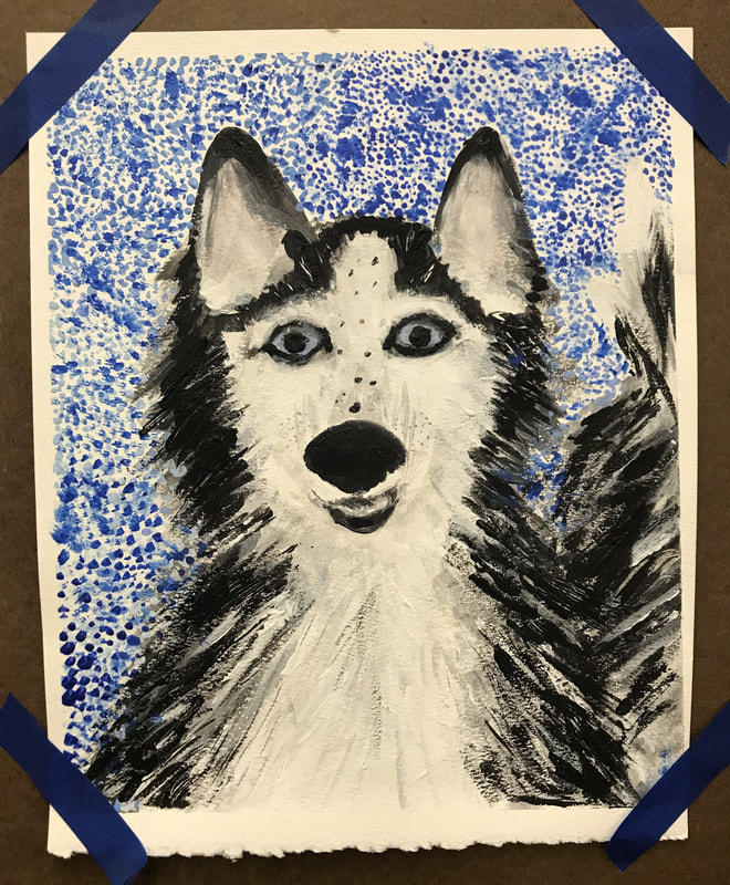
For this assignment, my group's topic was love and using acrylic paint. My painting depicts my old dog, who I loved very much. I used stippling, making lots of dots, for the background. I also used impasto, layered acrylic that's raised off the surface, and scraffito, scratching through one paint layer revealing another, for the fur. I think that if I could do it again, I would make the background more interesting, add more details, and either make it look more abstract or more realistic.
|
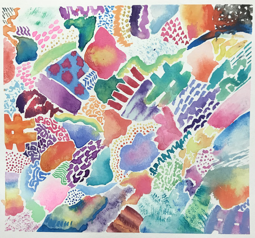
Abstract
|
|
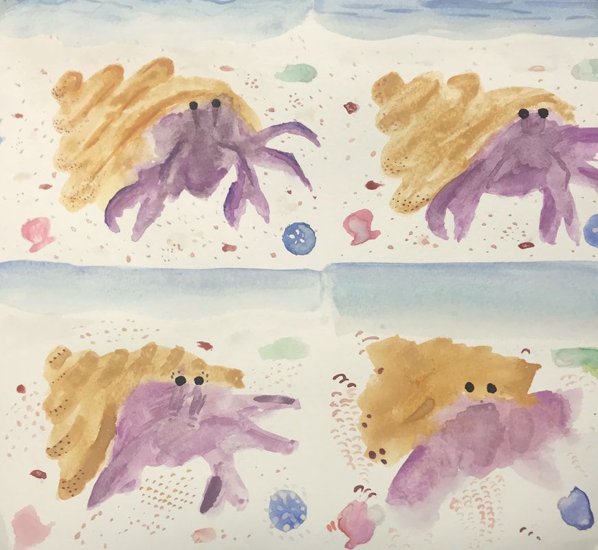
I learned that it is important to wait for the watercolor to completely dry before adding another color on top unless you want it to bleed. However, unexpected bleeding and branching of colors can be very beautiful. As I repeated patterns, it got easier each time. My favorite watercolor technique was wet on wet because the natural flow of the dye and water created designs that I couldn’t otherwise create. My least favorite watercolor technique was the salt because I don’t like how the undissolved salt looks on the final piece. I related more to Kandinsky more than Mondrian because I had more curvy lines and variety of colors. In one of my pieces, I used both muted and bright colors, bleeding colors versus hard edges, and pattern versus random lines. This expresses the diversity and spectrum in everything.
|
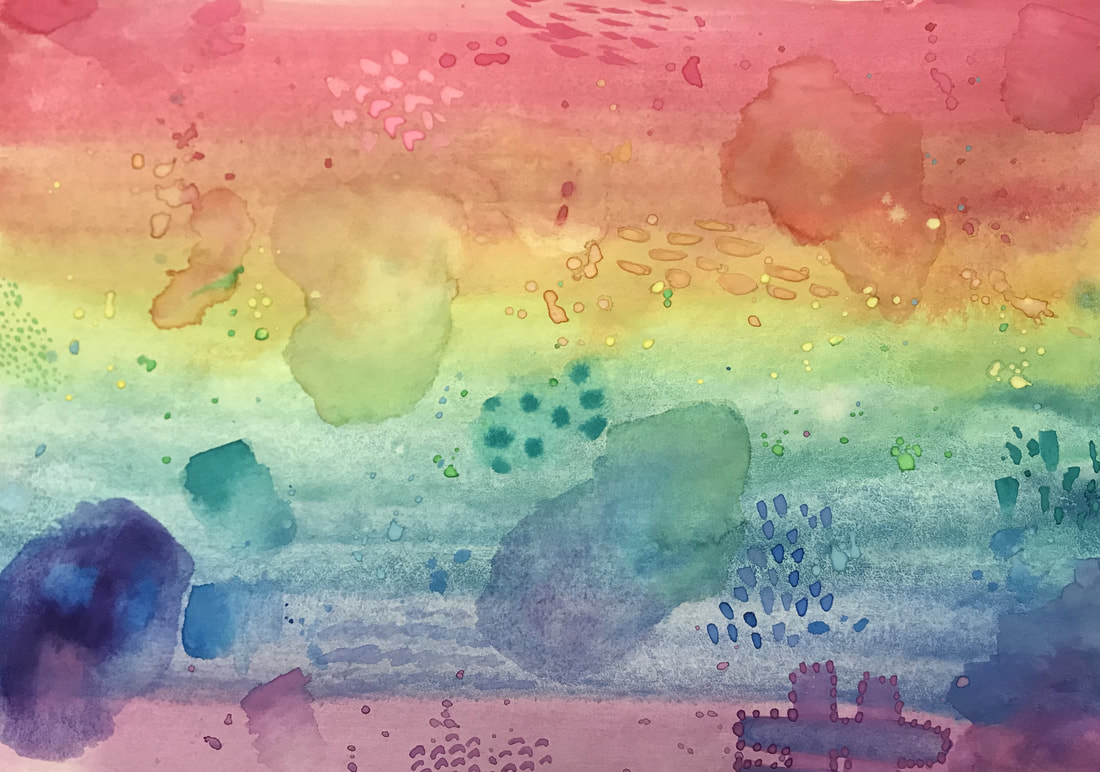
Paper Study
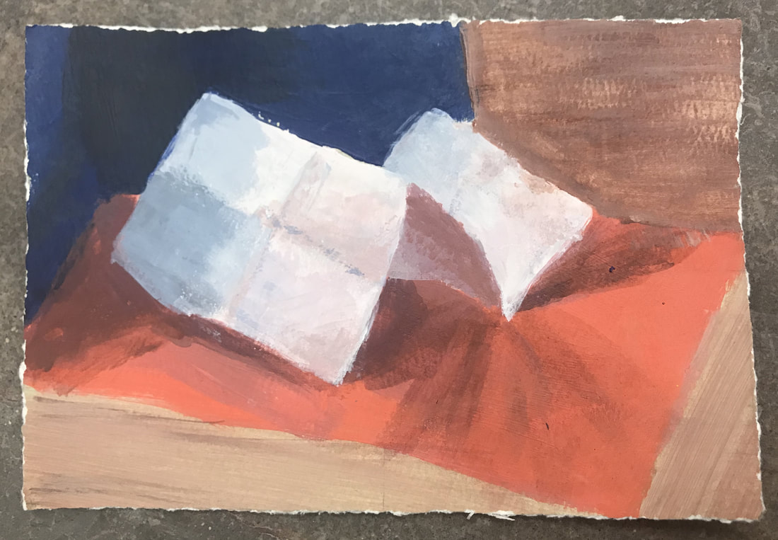
In these studies, I think that my layering and variety of colors is strong, but my lines could have been more defined and more blended for the paintings to look more natural and realistic.
|
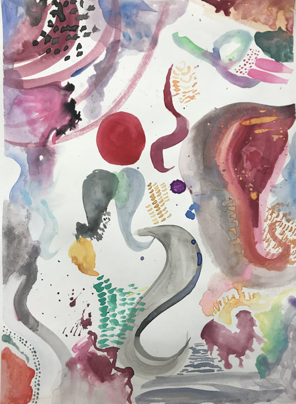
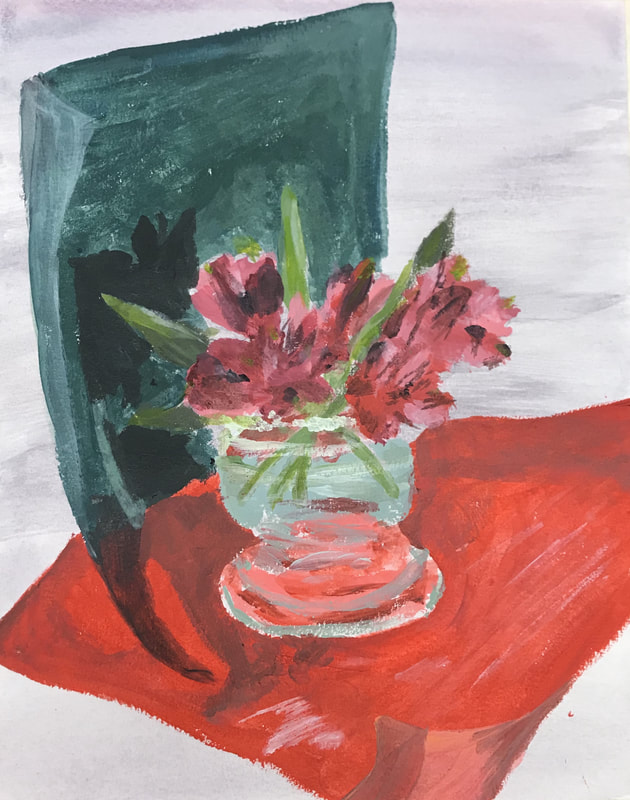
Flower Study
|
|
Brianna Shell
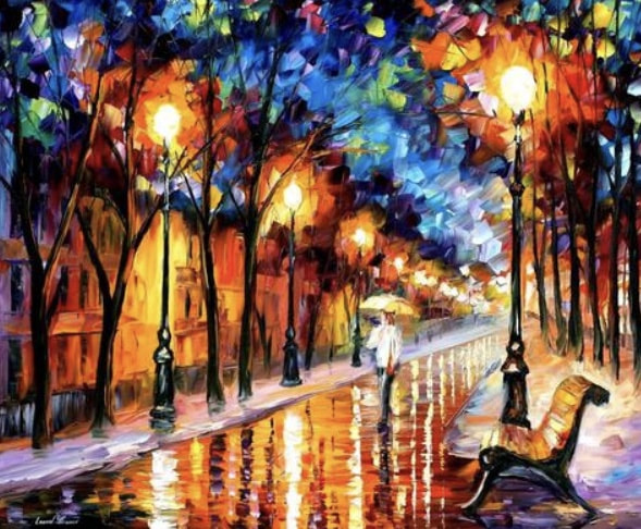
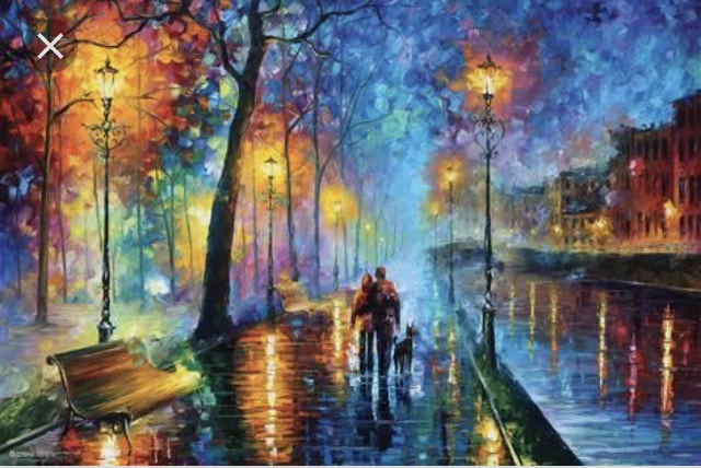
(American, 2000) Lights After Hours, 2018 Acrylic Lights After Hours is painted in Shell’s characteristic style of bright colors contrasting darkness and eccentric texture. The city life is rendered with the beauty of darkness, rain, and lights. The street with a car zooming past through the gloom signifies the hustle and goals humans have through the night and how technology rules the world. The water on the right side of the road symbolizes serenity and tranquility amid chaos. The colorful buildings represent the liveliness they hold within their walls, and the tree represents life continuing. Although there are many signs of life, the picture looks empty, lonely, and unfulfilled. The circle of light reflections surrounding the streetlights draw emphasis on light during the dark. A couple with an umbrella is seen walking a street of the city. This is significant because the people are unidentifiable and can represent the love, companionship, and protection in the viewer’s own life. Shell’s work has been associated with Leonid Afremov. |
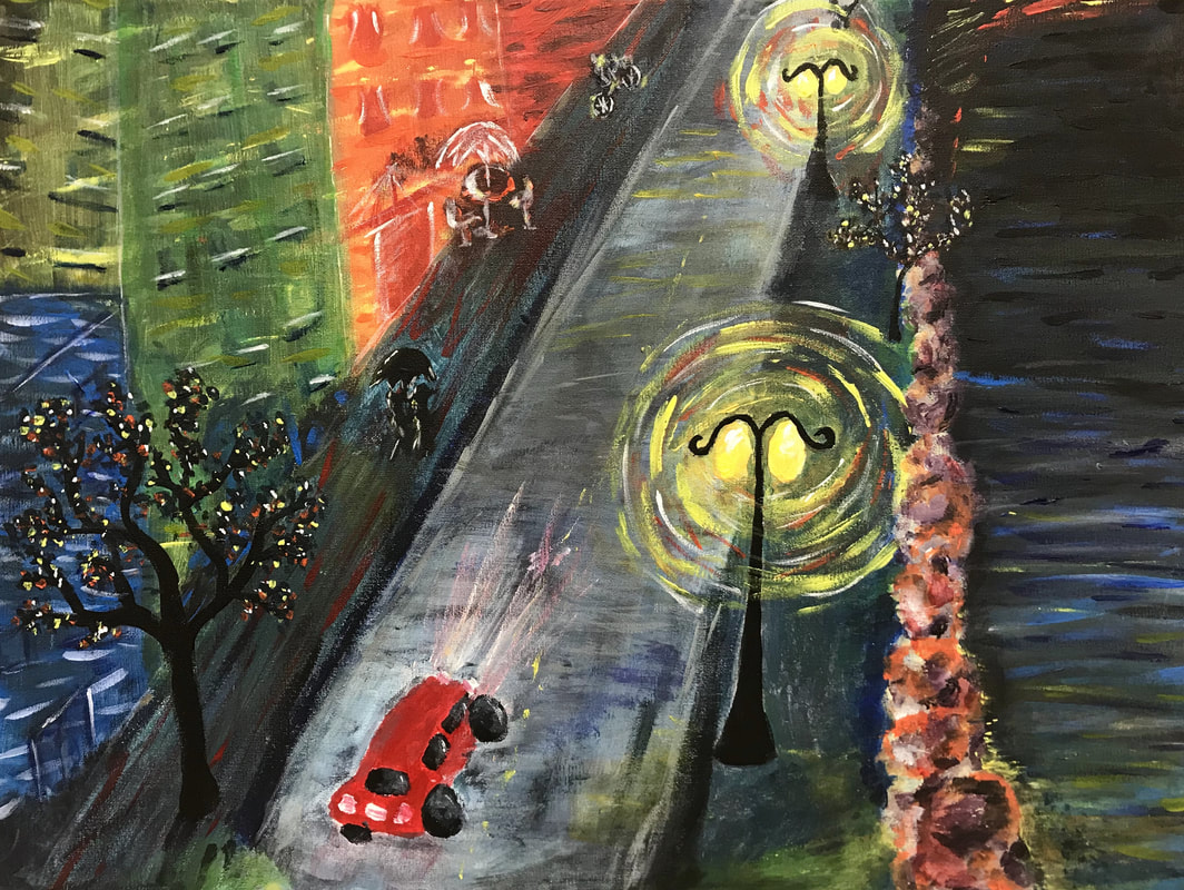
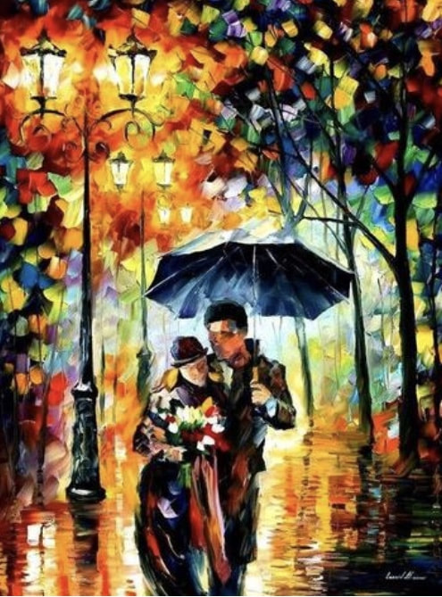
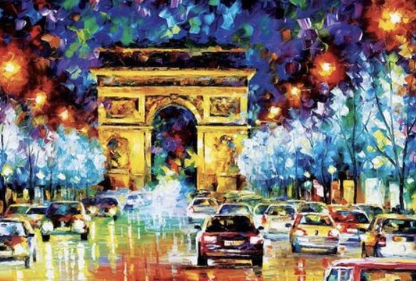
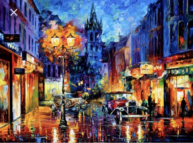
Lights After Hours is inspired by Leonid Afremov. I liked his vibrant, bright colors and strikes with the palette knife. I also drew inspiration from his subjects- a lone, beautiful, rainy city with few people. For my painting, I should have used brighter colors and a wider range of values. I should have done more details and actually use a palette knife to accomplish the texture. I would also change the perspective of the piece. Below are some examples of Leonid's Afremov's work.
|
|
|
|
|
|
|
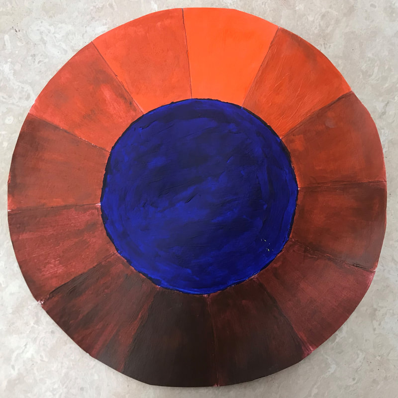
The “sophisticated paint by number” assignment. You start by tracing a pattern from a fabric onto a piece of paper and dividing the paper into six sections. In the first part, you cut and glue a piece of the fabric on the paper. In the second and sixth section, you match the fabric’s hues, intensities, and values. In the third section, you paint with the complementary color (opposite on the color wheel). In the fourth section, you paint with the complementary value. In the fifth section, you paint with the complementary intensity.
From this assignment, I learned that color matching takes a lot of trial and error to get it right. My greatest successes were following the details of my fabric’s pattern. I struggled with not exaggerating the differences in each block and trying to figure out the complementary values and intensities. Intensity is when you mix in the complementary color so its dulls the color and makes it more of a brown hue. To change the value of the color, you add in more white or black to make the same hue lighter or darker. |
|
|
|
